


This will be my last post to this blog! I hand in my work tomorrow, and then its all over. I haven't used this blog as much in my second year of the project, mostly because my personal website became the dominant place to post things. I've also had another project to work on this year (with a website in the making) which I will be posting to from now, if you are interested.
So, in closing, this project has formed the majority of my degree work over the past 2 years, and I am satisfied with the outcomes I have achieved. The showreel/trailer will be up on my personal website by the end of the week, and should be on NUCA's iTunesU account very shortly after.
Thank you to everyone who gave me feedback and followed this project, I hope you enjoy the showreel.
Sunday, 22 May 2011
Tuesday, 17 May 2011
Craft Apps: Trendy?
I have found various paper-craft wonders while searching the web over the duration of this project, and many of the related ones I have also posted about. While making my showreel/trailer the past couple of weeks, and reviewing the version of the Shop which I exhibited in the NUCA Christmas show, I have seen unintentional similarities between my work and handmade crafts that are for sale on websites like www.etsy.com. There are countless blogs and forums online dedicated to DIY chic and vintage handmade goods, showing there is a huge potential market for apps that utilise this trend.
 A series of apps along these lines are Martha Stewart's Digital Living magazines for iPad, they are
full of beautiful ideas for the home. A lot of people, particularly young women, are obsessed with viewing, making and collecting pretty, crafty things. In my opinion this is something games should be tapping into more, and apps are the perfect place to start because of their necessity to be delightful to gain any popularity. There also a lot of this demographic who already own iPhones!
full of beautiful ideas for the home. A lot of people, particularly young women, are obsessed with viewing, making and collecting pretty, crafty things. In my opinion this is something games should be tapping into more, and apps are the perfect place to start because of their necessity to be delightful to gain any popularity. There also a lot of this demographic who already own iPhones!
Thursday, 28 April 2011
Title Sequence
I have been working on a title sequence for the trailer showreel recently, which featured the title of the game against a period wallpaper.

Then I was browsing Channel 4 programmes and was shocked to see the similarity between my title shot and the title image of the topical Meet the Middletons. Uncanny.
 My title appears after a paper radio, which plays music of the era to accompany the trailer, and fades into darkness as the first scene is revealed. Today I also watched several training videos on After Effects about animating text, and other useful tricks. I may choose to animate the text if I find an appropriate way. As for now I like the effect it gives as static text.

Then I was browsing Channel 4 programmes and was shocked to see the similarity between my title shot and the title image of the topical Meet the Middletons. Uncanny.

Wednesday, 27 April 2011
Shop Font
I finally made a front to the paper shop, including cutting out all of the tiny windows (twice! Digitally afterwards).


I wanted the interior visible from outside and the front to lift like a curtain. After trying this digitally it might look better if it were to part in the middle like a curtain. At the moment I am undecided and need to play with it more in After Effects, but I am pleased with the shop front overall and hope it fits nicely into my showreel.


I wanted the interior visible from outside and the front to lift like a curtain. After trying this digitally it might look better if it were to part in the middle like a curtain. At the moment I am undecided and need to play with it more in After Effects, but I am pleased with the shop front overall and hope it fits nicely into my showreel.
Tape on The Windows
One of the many faults with the rough cut showreel is that the pink-tinted shop looks as though it is the sweet shop. To change this I have done some research into the practice of taping up windows so they don't blow out with nearby explosions. This is a common occurrence in wartime for homes and shops, and a sinister reminder of danger while people go about their day.


Saturday, 16 April 2011
Showreel: Rough Cut
Yesterday I made a rough cut of a showreel in order to spot any gaps so I can fill them now. I was quite amazed at how well some of it fit together, especially with the music I had chosen. Even with everything sort of shoved together it came to 1:30! Because of this I am inclined to plan another, possibly shorter, development showreel. This will take a lower priority at the moment while I iron out the kinks in the main one. I am aiming for more of a 'playthrough'/teaser-trailer kind of thing with it.
So far I have been using photoshop to make high resolution files, but used quicktime image capture and imovie editing for convienience. The image quality is very low as you may imagine, and I am not even going to export it in its current state as it is simply for experimentation purposes.

So far I have been using photoshop to make high resolution files, but used quicktime image capture and imovie editing for convienience. The image quality is very low as you may imagine, and I am not even going to export it in its current state as it is simply for experimentation purposes.

Tuesday, 12 April 2011
Music in the Public Domain
All the music we use for our showreels must be in the public domain or we have to gain specific permission to use it. Luckily for me, the main piece of music (at moment its a tough decision between a few songs) is going to be from 1930s. Hundreds of beautiful old tracks can be found on archive.org or jazz-on-line.com, both of which state they do not intend to infringe any copyright and all their tracks are available to download.
Another great source for dramatically different genres of music and music samples is Kevin Macleod's database on incompetech.com. I used a couple of his brilliant tracks for a showreel last year, and although very widely known and appreciated online already, I must say he really is amazing.
EDIT 15/4/11
I have chosen to use the song 'Love Is The Sweetest Thing' by Al Bowlly, as it is slow and melodic, and the singing starts sooner than my previous favourite 'Guilty' also a version by him. The song also has poignant references to feelings of love and uses the word 'sweet' fairly often. This is great, not because it is so cheesy, but because it goes back to my original storyline which was about a man who has lost his wife and remembers his younger years a lot better than recent ones.
Monday, 11 April 2011
Rationing Research
I have been looking for images to do with rationing, a great source has been BBC websites.

This particular section of the site is to educate children about shopping and home life in WWII, the 'fun facts' are quite useful.
"The only sweets not rationed in wartime were cough sweets. Sweet rationing lasted until 1953!"
"Even the moat at the Tower of London was dug up for vegetables."
"No icing on birthday cakes, after the government said no more icing sugar (1942)."
"There was lots of new meat-free recipes, such as turnip pie, or parsnip and carrot pie."
"The BBC 'Radio Allotment' grew 23 kinds of vegetables, with weekly radio reports on progress."
"Children helped 'Dig for Victory' by digging, planting and weeding. Some children worked on farms picking potatoes and fruit. "
Maybe I could make a level just about food.
Sunday, 10 April 2011
Grow Your Own
Part of my visual theme in having stark white paper to form the sweet shop is rooted in the idea of WWII rationing: the lack of sugar and the paper rations were supplied in. The levels are bright and full of colour in contrast, being the land of pure sweetness, but similar themes like scrimping and saving or growing your own food could appear here through the illustration. I have started exploring this with the countryside themed level, leading into images of tomato plants which could be grown in a suburban garden.

I stumbled across a relevant source of information on self-sufficiency in wartime Britain through Channel Four's series SuperScrimpers: Waste Not Want Not, where wasteful families are shown an alternative lifestyle by frugal women who have been practising it for years.
"70 years ago scrimping and saving was a point of national pride, there were countless news articles and broadcasts helping Britons dig for victory and make do and mend."
One of the things mentioned was that families used to keep chickens, rabbits and pigs during wartime and after to provide food for themselves more sustainably. "If you kept one or two chickens you'd have free eggs… during the war years everybody had chickens, rabbits and pigs."
Saturday, 9 April 2011
Seat Cover Patterns

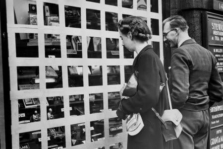
This banner is part of True of False game on the London Underground website, this question of course is true. I am intrigued by the choice to show the questions emerging from old and current seat cover patterns. Its a wonderful way of tying in several aspects of the underground's heritage, and to me feels like they could be from an exhibition. I wonder who made them.
I am currently back to working on some final level paintings/designs, and my next one will be about the railway/the underground. I may try and incorporate a seat cover design...
Saturday, 26 March 2011
Zen Brush
Heres an app that paints beautifully.

There are lots of drawing and painting dedicated apps, but this one in particular is a pleasure to use. Lovely digital paint simulation, designed to replicate authentic ink on a variety of surfaces.
There are lots of drawing and painting dedicated apps, but this one in particular is a pleasure to use. Lovely digital paint simulation, designed to replicate authentic ink on a variety of surfaces.
Sunday, 20 March 2011
What's Next?

This week I am going home, which means I have access to paints etc, and I'm taking my camera. I hope to film some shots of paint, marbling inks and other things to use in compositions in After Effects when I get back. Lots of other important things are happening at the moment, but this project is always on my mind. Working on the showreel should be satisfying.
Friday, 4 March 2011
Digitial Paint Bucket
Currently at the British Design Museum in London, there is an exhibit where you throw a bucket of virtual pain at an LED screen to create effects like this.
 I have no idea who made this exhibit, I have been trying to find out but haven't got very far... very clever way of using creating digital paint interactivity though.

Monday, 21 February 2011
BBC Four: The Beauty of Books
This evening I found an interesting series currently on BBC Four about the beauty of books, one episode in particular, Illustrated Wonderlands, about the relationship between illustration and text through the 19th Century to present. "Illustrated books set out to provide a fuller reading experience, to access deeper meanings through a synthesis of words and pictures.What a picture adds to a story and what the words leave out is key."
When talking about the illustrations to Lewis Carrol's 1865 edition of Alice's Adventures in Wonderland it was emphasised how important Carrol regarded the illustrations to accompany his writings. Employing John Tenniel as illustrator, Tenniel's characters were much more sophisticated and naturalistic than Carrol's original drawings, but still true to being absurd. In these ways they invited adult interpretation, allowing the book to be enjoyed beyond childhood. They even included small in-jokes between author and illustrator, such as a monkey thought to the hotly debated Charles Darwin, which the Victorian readers would also enjoy. The character illustrations in Alice's Adventures in Wonderland are vital to accompanying the text because the characters are not much described in detail.
A modern interpretation of the illustrations for Alice's Adventures in Wonderland (of which there are countless examples) by John Vernon Lord was discussed. He explained that by not including Alice in his illustrations you, the reader, let yourself become Alice. He also thinks Carrol would be furious at this as she is the heroin of the story and would have wanted her depicted. These are things I am directly concerned with in my game design.
The programme also discussed Mervyn Peake, originally for his Alice illustrations, but mainly for his passionate belief that illustrations were important for serious adult fiction, including his own books aimed at adults. Best known for his Gormenghast series, published circa 1950, where the illustrations were drawn before the descriptions were written so that he had something formed which he could describe. His characters were described as having their souls on the outside of their bodies.
"Picture books can be very deep and often more universal and more adult than the next age group [of books] up.… They can be about life and death and fear and all sorts of things." - Julia Donaldson
I enjoyed this episode very much, a great trigger for thinking about my own story and animation again after such a long break. Now that I have playtested my game (documented offline, sorry!) I am going to attempt fitting in some work on the animation around the other projects I have taken on recently. I hope I will have something to show for it within the week.
Wednesday, 26 January 2011
Life Size Cardboard House
Artist Luise Valdes made a replica of their own apartment out of unused cardboard, its called Casa de Karton or Cardboard House.
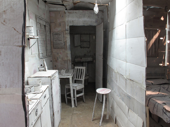
They whitewashed everything before re-drawing details on to give the effect of a drawing come to life.

I think the effect is brilliant, and a complete contrast in scale to my project. I am not aware of the scale when looking at these photos, I half imagine a huge hand coming in at the side to rearrange the furniture like a model. But I think this is in the photography mostly, there are give aways to the scale in the characteristics of the boxes and the tape fixing it together.
They whitewashed everything before re-drawing details on to give the effect of a drawing come to life.
I think the effect is brilliant, and a complete contrast in scale to my project. I am not aware of the scale when looking at these photos, I half imagine a huge hand coming in at the side to rearrange the furniture like a model. But I think this is in the photography mostly, there are give aways to the scale in the characteristics of the boxes and the tape fixing it together.
Friday, 14 January 2011
Paper Playtest Ideas
Ideas for the paper play test! Initial ideas are to print each of the level designs in full (I will make two or three possibly) and print each of the menu screens. These can be pinned on the wall or displayed on a table, and people can rearrange them as they see fit. That is the whole idea of course! Seeing what a user would prefer to play with, or understand better.
Another idea I just had is to make a iPhone frame, to slide up and down the printed levels. This way I can test whether the game would work better portrait or landscape.


Another idea I just had is to make a iPhone frame, to slide up and down the printed levels. This way I can test whether the game would work better portrait or landscape.


A further idea is to let people draw onto the level designs, to see what people would expect from a maze/path building gameplay. This way I can see what people would find fun, difficult, or easy, and try and make it more exciting.
I will need to develop level ideas now, to have them printed for February. I was planning on doing the animation first, but this is one of the things I was referring to in my last post about rescheduling.
Thursday, 13 January 2011
Update: Week 2
Its the second week of the new term and my schedule for the remainder of the academic year is to be re-assessed. This is to accommodate a few more things I have added, and to compensate for the storyboard I have not managed to do over Christmas. For the next couple of weeks I will be finishing my research report, but then I will start on some paper play testing for my game! I want to spend time working with players and seeing how they would use what I present to them. This will help with gameplay design, saving a lot of time that could be wasted programming things that might not work. I want to focus a lot of energy on this part, and try to understand the transition between design and production a lot better.
Monday, 27 December 2010
The Borrowers - Play
This week I saw an amateur dramatic production of The Borrowers, it was an excellent rendition of story I love, with all the themes I love too! The use of scale was excellently incorporated into the stage and surroundings, with larger than life props (although all a bit irregular and inconsistent, which can be forgiven). On several occasions a trap door was used to represent the floor board under which the family lived, while at the back of the stage represented the tiny house under the floor. A huge screwdriver came down from the ceiling when a corresponding smaller version was put through the trap door! And dolls house furniture turned life size when placed under the floorboards too.
The story of The Borrowers, miniature people who live alongside 'human beans' as they call them, always hiding but venturing out to collect household objects to fit their needs. In terms or my game this play reminded me of the many uses of a theatre stage, and of scale yet again! Two things I am directly involved with in my game, especially in the intro animation which I am now able to spend time on.
It made me want to watch the 1997 movie, and then I remembered that Studio Ghibli are doing a rendition of it focused on Arrietty. It isn't as stylistically inspirational to my game, but I am looking forward to it nonetheless.
Friday, 10 December 2010
Sylvain Chomet Revisted
Now that I am working on my storyboard for the intro animation I thought it would be good to look at Sylvain Chomet again, having last looked at him so long ago it doesn't even appear on this blog! This time I have been looking at some of his earlier work and remembering The Illusionist which I saw in Autumn.
 This is a screenshot from
'La Vieille Dame et Les Pigeons'
(1998)
This early work is much less refined, but are expressive in some ways. Taking most interest in the street scenes, this one is beautiful - appearing washed out but containing so many colours.
The Illusionist was set in Scotland (where Chomet's current studio is) but in the past, and in London - both rainy and foggy and bleak. There were wonderful street scenes here too, so much to take in.

Thursday, 25 November 2010
Christmas Show - Inspiration
In regards to my personal development, particularly my plans to put on an exhibition next term, I have put some work in the NUCA Christmas Show. As the entry doesn't have to be Christmas themed I made a shallower, smaller version of the shop to submit. I thought about submitting a print of other parts of my project but the depth of the box frame seemed ideal for another shop, and it will be nice to see how it will work as an exhibit.

 I hope this experience will be helpful, it has definitely been enjoyable getting back to using paper again.
EDIT: In doing this I was inspired to make an alternate menu system which takes place completely inside the shop. I had been thinking about this earlier while making the first menu system, and feeling it needed to be more coherent. After showing a few people and getting some positive feedback towards this I have set out making an alternate system today, as an idea of what could be done. It can also be seen here http://www.rosieball.com/Site/Showreels.html


EDIT: In doing this I was inspired to make an alternate menu system which takes place completely inside the shop. I had been thinking about this earlier while making the first menu system, and feeling it needed to be more coherent. After showing a few people and getting some positive feedback towards this I have set out making an alternate system today, as an idea of what could be done. It can also be seen here http://www.rosieball.com/Site/Showreels.html
Monday, 22 November 2010
Playthrough Video
I have spent all day making my prototype in Gamesalad Creator, before today I had a rough skeleton but now I have fleshed it all out except for the levels. That means I have a working menu system! I have recorded a play-through in Camtasia, and put it on my portfolio site. It is the first video on this page...
http://www.rosieball.com/Site/Showreels.html
http://www.rosieball.com/Site/Showreels.html
Tuesday, 16 November 2010
Memories
I have been neglecting development of my game content, in terms of level design and narrative - which in this game go hand in hand. The embedded illustration of the levels illustrates the narrative, memories which the old man describes as they appear.
I will be dedicating my time to this during and post Christmas period, but I will need to put some updates level designs in my Revised Game Guide document. To get the ball rolling again I asked a friend who works in the health care industry, specialising in home assistance for elderly people, if she could remember any tales anyone has shared with her. I was particularly looking for happy memories, as my game memories are all meant to be positive. Her response was incredibly insightful, a mix of happy and sad memories...
One was of a lady who had to leave her family farm in order to downsize her property after her husband passed away, fortunately her son now runs the farm but she now lives in a cottage nearby with few visitors.
One man loves to smoke his pipe and talk about sailing, now that he no longer has the health to sail. He believes the smaller boats are better, fancy cruise ships are just showing off.
Another man reminisces about his dancing days, he used to teach the Samba, Ballroom dancing and others, but now he can't. He fell in love with his wife when they were young and they still live together.
I was pleased to get some happy memories, if coupled with a sad one each time. I know a few things my own grandparents have said about when they were evacuated, or not evacuated, and what they enjoyed from their childhood. I will need to draw some new level designs before submitting my Revised Game Guide, and I will try to incorporate some of this research.
Revised Game Guide Document
Lately I have been working a lot on my programming research and trying to establish a prototype menu system so that, over Christmas, I can work on my animation with a bit of peace of mind. That said however, I am also submitting a revised Game Guide document to communicate how the game structure and aesthetic has changed and progressed since my last Game Guide document was written (although useful, it is definitely out of date).
As the entire document reflects the aesthetic themes of the game, you should notice the title page reflects the level menu screen progression - the shelf of jars, from digital to paper.
 The other pages have also been changed to match the transition from digital to paper.
The entire game should also reflect this transition, through the start screens and animated sequence at the beginning of the game you are taken through the digital 'real world' into the white paper 'real world' in order to represent the starkness and depravity of sugar during WWII, when you are suddenly and contrastingly thrown into the 'sweet land' made entire of the opposite - pure colour and all digital. This is the kind of development with the game the new Game Guide should communicate.
Edit: I am also emitting any use of texture or stock image that I did not make myself, from all documents and game content. Examples of this include the wallpaper background and elements used in the end of year show reel, the shelves and picture frames.
As the entire document reflects the aesthetic themes of the game, you should notice the title page reflects the level menu screen progression - the shelf of jars, from digital to paper.

The entire game should also reflect this transition, through the start screens and animated sequence at the beginning of the game you are taken through the digital 'real world' into the white paper 'real world' in order to represent the starkness and depravity of sugar during WWII, when you are suddenly and contrastingly thrown into the 'sweet land' made entire of the opposite - pure colour and all digital. This is the kind of development with the game the new Game Guide should communicate.
Edit: I am also emitting any use of texture or stock image that I did not make myself, from all documents and game content. Examples of this include the wallpaper background and elements used in the end of year show reel, the shelves and picture frames.
Friday, 12 November 2010
The British Museum: Exhibition on Age and Medicine
Yesterday I went to the British Museum and saw an exhibit related to the theme of ageing, it was a display of medicine that the average human would take in their lifetime. It showed a mix between male and female, covering important stages of different people's lives - daily arthritis medicine, hip replacement medication, vitamins and supplements taken over the duration of several pregnancies.
 Along the side there were photographs of people at various ages, telling little bits of peoples lives. I found the photos made the exhibit very personal, and really emphasised the rest of the exhibit. Each photo was a memory to someone.
On the way I took a few photos of the underground, as I have been thinking about making a memory in my game based on the underground.


On the way I took a few photos of the underground, as I have been thinking about making a memory in my game based on the underground.

Monday, 1 November 2010
Narration: Audiobooks
In re-doing my Game Guide Document from last year I was reminded that I planned for the game to have narration, to create a story book feel. I have been thinking about this lately, after listening to several audiobooks over the summer, ranging from the wonderful Stephen Fry reading Harry Potter to some terrible, free audiobooks including various Jane Austen works. Traditionally, the narrator of the audiobook will also do the character's voices as opposed to radio style adaptations where there are additional voice actors to play each part, and usually sound effects and music. This can work well to create atmosphere and to make convincing and enjoyable characters, but I feel the more traditional style with one narrator would suit my game idea better.
Having one voice do all the narration and character parts, or even no character parts at all, would leave adequate mystery for the audience to interpret their own versions of the characters (as previously discussed in length in my last post). Whether this works as well when you can see the character design, as you would do in my game, I have yet to figure out. For now the plan is to go ahead with narration as the main storytelling device, and I have suitable voice actor in mind.
Having one voice do all the narration and character parts, or even no character parts at all, would leave adequate mystery for the audience to interpret their own versions of the characters (as previously discussed in length in my last post). Whether this works as well when you can see the character design, as you would do in my game, I have yet to figure out. For now the plan is to go ahead with narration as the main storytelling device, and I have suitable voice actor in mind.
Wednesday, 27 October 2010
Chat With Sharon
On Friday I had an excellent, unplanned tutorial with Sharon, who was of great help last year. Discussing time management and my priorities for this year was very reassuring, yet we talked most about the exhibition I want to hold towards the end of the academic year. It was nice to experience another perspective on my work, and such a positive one from a non-gamer - something I am striving trying to achieve.
Sharon and I talked about building fictional worlds, and how personal they become. I am a great believer in this and want to work towards capturing this effect in my work. We mentioned how authors express themselves through their work and it can become very personal to them, but they must allow room for the audience to make an interpretation of what they see, which in turn becomes very individual and special to them. One way it can be explained is like Plato's allegory of the cave - that when observing something someone has created, you see a projection of them and their creation. Then you interpret what you see however you want, usually enhancing the projection. This is a process which can be applied to all sorts of art forms, and reinforces the need for space (or mystery) for the audience to fill in themselves.
This whole idea of personal connections with games is synonymous with hand-held gaming for me, if you can literally hold the world in your hands it becomes yours. This effect was strongest for me when I was younger, but I still feel that way about some new games now. I think it is possible with iPhone games, but rare at the moment. I have yet to find a game I feel connected too like that...
Thursday, 21 October 2010
Animated Short About A Shop
This animated short has many similarities with my game idea! First off it has no dialogue, and it starts with a child walking down a deserted street... they then reach a spooky looking shop... sound familar? In this short, though, the shop is creepy and it has only dolls in it. Watch the animation to get the story, I won't ruin it. But it was lovely and very helpful to see how someone has produced such a high quality animation with such similar themes to me.
Wednesday, 13 October 2010
Ageing in games
I was reading this article about games that have themes of ageing, and having played The Graveyard by Tale of Tales, I played Home by Increpare Games - which can be found here

I liked Home. The restricted motion, the limited options, and its a short game, but the messages are powerful. You play as an old man who has just been admitted to a care home, the game takes place in one room, with your hunger, exhaustion, happiness, and bladder meters at the top. I found it to be more direct, than The Graveyard for example. Even though your options were right there, the food on the table and the bed next to it, you just found yourself unable to reach them and before you knew it you had collapsed. This puts the player in the place of the old man, and you are as bemused as him when you find that the doctors and nurses have made some quite life altering decisions for you while you were asleep. The game ends with a visit from your daughter, which is the only instance of this in the game, yet she says she has visited every week. To me, the feeling of trust is strong in this game, you have to just trust everyone else and the character you play is happy.
I liked the enforced feeling and restrictions on this game, I also liked the basic pixel style which proved just enough to create the right environment, focussing on the messages.
Sunday, 3 October 2010
Notes from 'Chris Crawford on Game Design'
I am reading Chris Crawford's book 'Chris Crawford on Game Design' and taking extracts for my research project. Here's just a few things I found to be more related to my project work...
"Common mistakes - Obsession with Cosmetics
…There are five common motivations to equip a game with good graphics and sound:
1. To further gameplay
2. To permit the player to show off the superior cosmetic capabilities of his new computer
3. To show off the superior technical prowess of the programmer
4. To keep up with the competition
5. To provide the player with images and sounds that are intrinsically pleasing
Reason #1: To further gameplay by making the player's situation and options as clear as possible. This is the only good reason for pursuing cosmetics.
…Everything you put into the game should support the gameplay. If it doesn't support the gameplay, it doesn't belong in the game.
…Imagination can just as easily be smothered by excess information as stimulated. Graphic realism stimulates the imagination, but it must leave room for the imagination to run free.
…Design is not an accretive process! Piling on more features does not necessarily make the game any better - it just makes it more complicated… Making a game bigger doesn't make it better; it just makes it… bigger.
I need to concentrate more on the interactivity of my game, this needs to become the centre of the game. If I can make good levels, I want to eliminate most of the 'real world' sequences between levels. Less of a cut-scene kind of feel. I am happier to go back to the menu screen and show it change than show an animation, this will shorten the game and its content. Little extracts of story will be incorporated in the narration, which I now want to happen inside the levels at key points.
Thursday, 23 September 2010
Street Scene
A scene from the intro that I have been working on this week, on and off. I need to make an animatic before I continue I think... getting ahead of myself with the details.


Norwich: Then and Now
I walked through a small exhibition in Castle Mall the other day of photographs from around Norwich in the past (not exactly sure on which era) but some of the shop photographs were great. I managed to record some of them for my reference collection, but regretfully found out little about the exhibit.


I still haven't figured out where these places were/are in Norwich but I think this one may be near Anglia Square or Tombland?
On my way home I photographed the shops/bars opposite John Lewis too

I am noticing patterns in the design for shops, but each are unique. Each has its own number of windows, with different styles, and most interestingly they are all slightly different heights. These are things I will try to remember when drawing shops and street scenes for my introduction animation.
Monday, 20 September 2010
Re-Design: Old Man
Here is a mock up re-design of the old man, I started with the head from the initial speed paint and made a body to suit that.


Sunday, 19 September 2010
Recent Reference Photos
Streets and rooftops from a train


A Mr Simms sweet shop in London this time, even more perfectly situated than the ones in Cambridge and Norwich.


This photo reminded me of some I found a few weeks ago, when looking for wartime photographs, in particular the one below...
 I love this photograph, the scene is so still and the light is so soft at, such a dramatic angle.


A Mr Simms sweet shop in London this time, even more perfectly situated than the ones in Cambridge and Norwich.


This photo reminded me of some I found a few weeks ago, when looking for wartime photographs, in particular the one below...

Friday, 17 September 2010
Re-design
In less than two weeks I start my final year at Norwich University College of the Arts, during which I plan to continue this project and make as close to a functioning, playable version of this game as I can. My experience is in illustration and small amounts of animation so I will be utilising these skills most, but I am eager to learn other skills in my final year. Over this summer I have begun re-designing most of the game, from now I will be looking at what I created last year in a professional and practical way, and adapting it to be a plausible, working game, considering my abilities and time-scale for this year.
Here are some fundamentals that are strong in my mind for this year;
Back to basics - the game's core concept is still to be:
Short, memorable and delightful.
The characters need to suit the environment, and vice-versa - Building on the success of the paper shop, I have re-designed the 3 characters to be more suited to it - working with their silhouettes I have changed their shapes to be more iconic and easily identifiable. This will also help with animating the old man, his arms and legs etc will be better shapes to cut out and move.
The shop is a stage - the idea of a miniature theatre should not be lost this year and I want to look into ways of emphasising it. I have begun designing an introductory animation that starts digital and turns to paper, blending the two worlds, and really isolating the shop as the most paper place in all of the 'real world'.
Cut down - decide which scenes need to be made and how many, what can actually be produced and what is not plausible. Cut out fantastical ideas and keep to the core concept alive. This means sorting out gameplay that is actually able to me made.
Different - Having said the above, this game is not a platformer, or a shooter, and the whole idea is to bring something knew to players that will delight them. Ideally it is a creational game where the player builds their path within the levels to complete them. I am prepared to compromise my concept to make it work, but I won't let this game lose its meaning. If I cannot make the levels or find someone who can, I will concentrate on making the other aspects of the game.
Get the story straight - Part of the cutting down process will involve each animated scene that is to be included is planned early on, storyboarded, and all parts to be made. This will ensure the least time wasting.
And finally, this is still an art project and I want it to feel like one. I have taken a lot of photo references over summer and found things that have influenced me all over the place. I am starting the new term with enthusiasm to make something lovely.
Tuesday, 18 May 2010
Critical Evaluation
At this point I have very nearly completed my second year at Norwich University College of the Arts but I have only begun this project and hope to take it much further next year. This term I have assembled an online portfolio for myself, with a large section dedicated to the Sweet Land game concept, and a section for showreels including the one for this project of everything created so far this year. I feel that alongside this blog my online portfolio and the showreel are the main pieces I have worked towards for submission this term. In saying this, I do not believe that any of these are complete, I hope for them to display the work produced so far in an appropriate manner that compliments and strengthens the work.
My portfolio is very easy to add to and rearrange, and it was a very beneficial learning process to use iWeb. It is clean and uncluttered, as well as thematically in keeping with my other work. I chose to include work produced outside of college on my portfolio because it often affects my coursework as it develops and I experiment with techniques in my personal work. I am pleased with my portfolio and worked hard to chose what to put on there, including only pieces that are to the best of my abilities and improving on older pieces. I do feel that I have been able to create a professional and individual portfolio and that in doing so I have developed my professional skills greatly.
This blog has been an excellent scrapbook for the reference photographs I have continually taken this year, and purchasing a camera has been a great investment. It has also been a place to analyse my findings and I have enjoyed researching my project's themes and related artists, even so far as to influence my subject of research in Critical Studies to be concerned with age in games. I have really enjoyed looking at age in games and learnt a lot, I never expected to find myself so interested in this topic but I feel it is very important and holds some brilliant stories and experiences that have yet to be explored in any great detail by digital games as a medium. My blog also allowed me to receive comments of criticism and encouragement from just about anyone who wanted to get in contact, and I reviewed some of these in one of the posts. I found this interesting as I have never published an idea for a game in a public space before. The most influential feedback I received during this year was undoubtedly from Sharon, which I covered in great length in another post, but which really cemented some of my core concepts and engaged me in dramatic changes of other parts that had been weaker.
I am aware that I have strayed from my learning agreement criteria, originally I thought that I would be able to animate a section of the sweet land level to communicate the feel I wanted it to have. Unfortunately, after several attempts at using vector animation programs including Flash I found that I could not effectively achieve the right movement that the colour would have, and working frame by frame with vector proved even worse for this. I did however manage to utilise the way that Flash works to create parts for the showreel, which I then began to focus my efforts on. I did experiment in using Corel Painter's animation facilities but there were extremely lacking and not at all designed to make lengthy animations of any great complexity, as well as After Effects which I hope to use a lot more next year and will research over summer. I also hope to be introduced to other more suitable animation programmes next year being in the same building as the animation course.
The showreel turned into my focus as I found I could display pictures of the characters in a setting which captures the overall feel of the game whilst also being able to communicate some physical attributes of the colour as it drips through. The inclusion of the other parts of the game, the shots of the paper shop and the preliminary level designs, allows the showreel to contain each part equally and I am happy with this small insight into the game world which I believe it quite nicely achieves. The showreel predominantly scrolls, resembling the scrolling of the levels. I feel that the weakest part of my showreel is the imagery of the sweet land, and I did not spend enough time on this part. The images are too zoomed in and you lose a sense of the environment length and level aim of path construction. I would change this part if I had more time, and rework some of the level designs. I know to spend more time on this part next year, and I anticipate that it will need a lot of work.
The paper shop was laborious but extremely enjoyable to make, I think that building it has been an essential stage of the game world development and helped me maintain my vision of the shop being a miniature set or stage. Making the old man character in paper and photographing him to animate within the shop is definitely plausible, which is what I set out to discover in my learning agreement. I have found that I will need many more body parts, and the best way to know which parts is by making a storyboard. I have made a small animated experiment of these pieces in Flash which does work, but After Effects or Maya would be perhaps better. I will look into this in greater detail next year, as I still hope it will be the animation style for all of the real world scenes.
I have high hopes for next year and I have managed to maintained my enthusiasm for this project despite the technical and time-scale related challenges, but maybe more importantly I have managed to maintain the heart of the game concept and bring out of it some delightful moments.
Sunday, 16 May 2010
Showreel
Today I finished putting together my showreel, based on the shelf design I was experimenting with in a previous post. I decided to painstakingly animate the drips in flash frame by frame and then put the rest together in iMovie...
 I used music by Kevin MacLeod, you can see the full showreel on my portfolio site rosieball.com

Sunday, 9 May 2010
Creative Commons and Kevin MacLeod
I already knew a bit about creative commons licenses from my experience with websites in the past, so I chose a license for my portfolio site and put it clearly on the front page. Related to this, I was trying to think of music sources for some accompanying music to my project showreel and remembered the talented and generous Kevin MacLeod of http://incompetech.com/ who writes small and long pieces that span almost all genres and moods, all free to use so long as he is credited.
I chose the tracks I used because piano seems appropriately timeless and sort of comical, but the clarinet is quite sombre. I was planing on using distressed music that sounded like a vinyl record being played or more upbeat music box type thing, but it all sounded a bit creepy or eerie when I tried it. I think the ones I chose fit quite nicely.
Edit: I emailed Kevin MacLeod to say thank you, and he replied really quickly with a nice message. Creative Commons is an excellent way for creative people to help each other out and share things without the fears of their work being misused.
Monday, 26 April 2010
Paper Shop - Complete
I finally finished the paper shop set the other day and took many photos.


I also made some mock ups with the man in the shop, made from separate photos of each limb put together in photoshop.


Subscribe to:
Comments (Atom)